 |
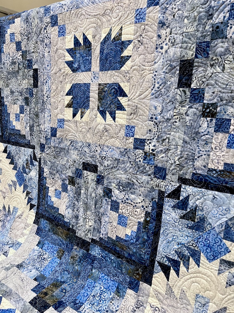
| Peacock Tail E2E Stitched in 40 wt Glide Thread, Color Warm Grey 4 |
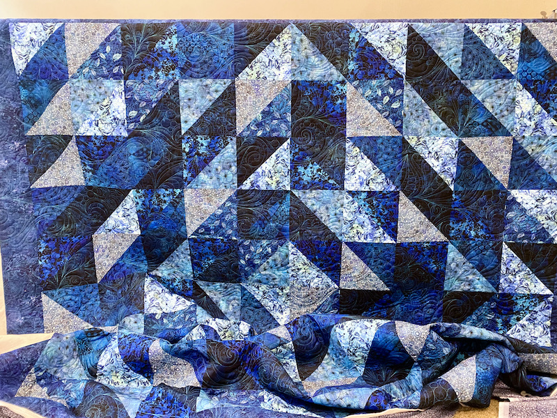
"I love that design, but will it look too busy on my quilt?" That's a question I often hear from my longarm quilting clients, especially when we're considering a newer design and I don't yet have photos of what it looks like stitched out. Just looking at line drawings of quilting designs, they ALL look really busy because of the high contrast of the solid black stitching line against a white background. However, in real life it's almost always the relationship between the fabrics in your quilt top and the thread color we choose that will determine how subtle or dramatic the quilting appears on your finished quilt. This beautiful batik quilt (It's The Road Home BOM from Wilmington Prints) that I finished recently for my client Mildred, pictured above, is a really good example of this.
Peacock Tail E2E for Subtle Texture
On Mildred's Road Home, I've quilted out Peacock Tail E2E, one of those designs that looks like it might be "too much going on" when you look at the line drawing:
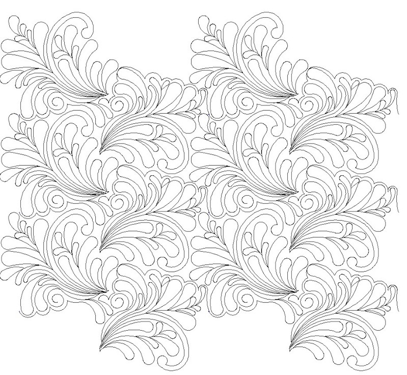 |
| Line Drawing for Peacock Tail E2E Quilting Design by Nancy Haacke |
A couple things to note about this design. First, it's a very large scale design, and the image above is showing six repeats nested together. You're not looking at the design anywhere near the size I'd actually stitch it out, either -- the purpose of this drawing is to give an overall view of how the design will repeat and "flow" across the surface of the quilt. I love the sense of movement this design creates and I love how the rows nest together so well -- you don't look at the finished quilt and see "rows" of quilting at all.
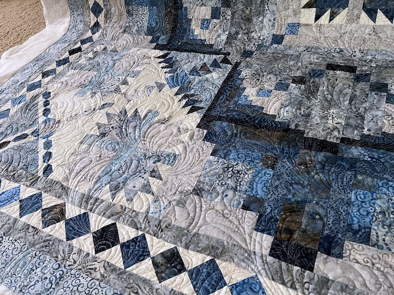 |
| Peacock Tail E2E on The Road Home, with Hobbs Cotton/Wool Blend Batting |
Although the feather quilting looks great up close, it doesn't detract from the overall elaborate patchwork design at all, as you can see in this photo of the entire quilt:
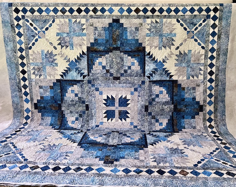 |
| Mildred's 89 x 89 "The Road Home BOM" Quilt |
Peacock Tail E2E for Dramatic Impact
Quilting designs will always, always show up more dramatically against solid background fabric vs. print fabrics. Quilting will also make a bolder impact when stitched in a contrasting thread color, in a shade that is a lot lighter or a lot darker than the fabric, or when it's a heavier weight thread.
By the way, this is something to keep in mind when shopping for your backing fabrics. If your quilt top is comprised of a lot of busy prints and you're not sure the quilting will show much on the front of your quilt, choosing a solid backing fabric that contrasts with the quilting thread will ensure that the quilting looks amazing on the back even if it blends in on the front.
Graffiti Quilting E2E #7 for Bold Drama
Here's another example using a different "busy-looking" digital design. On my own Color Outside the Lines quilt, I used Bottom Line 60 weight thread in Silver because I wanted to be sure the quilting design would stand out against my Kona Snow background fabric, but blend into my hand dyed fabrics and my Anna Maria Horner focus print.
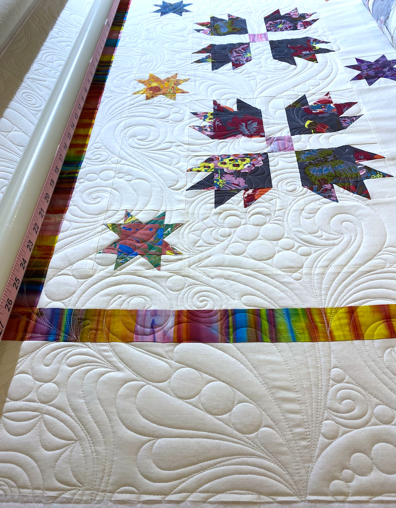 |
| Graffiti E2E #7 Quilting Design, Bottom Line Thread in Silver on Kona Snow Fabric |
Even though I used a very lightweight thread in my needle, the quilting is still noticeable and dramatic because the thread is a contrasting color and value (Silver against white), and it’s stitched on a solid background fabric. Where the quilting crosses the hand dyed and printed fabrics, the skinny Bottom Line thread just sinks in and disappears. Notice that, as deliberately bold as the quilting looks against that white background fabric, it still isn't anywhere near as "busy" on a real quilt as it looks in the line drawing of the design:
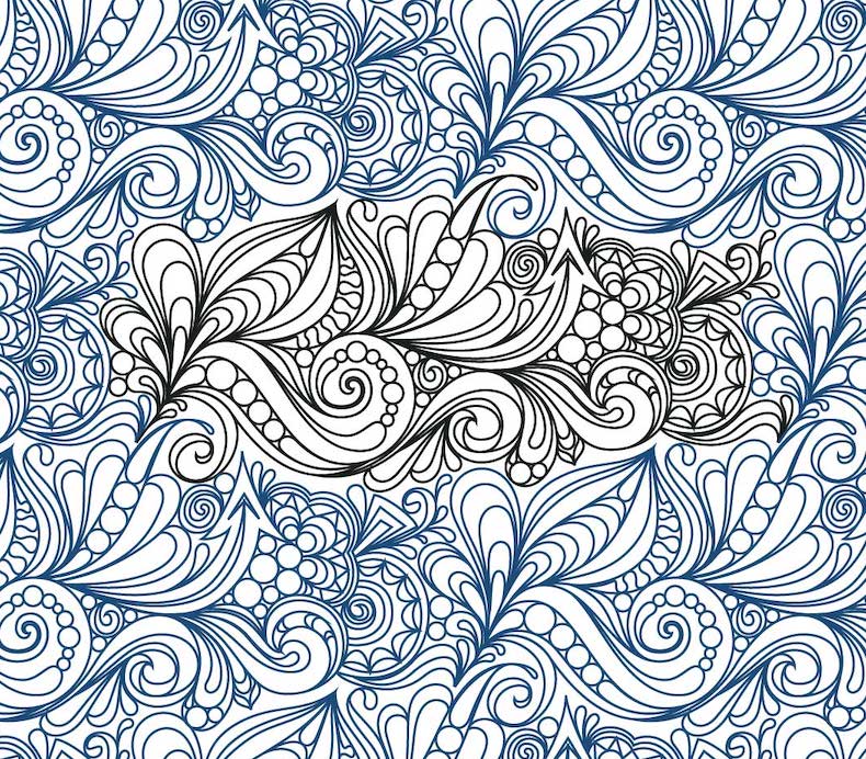 |
| Line Drawing of Graffiti Quilting E2E #7 by Karlee Porter |
Graffiti Quilting E2E #7 for Subtle Texture
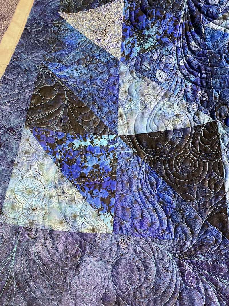 |
| Graffiti E2E #7 on Pam's Jason Yenter Quilt |
HOWEVER... Check out the BACK of Pam's quilt! I used 60 wt Glide in Hawaiian Blue in my bobbin, and the graffiti quilting shows up and looks amazing against her deep tonal blue backing fabric!
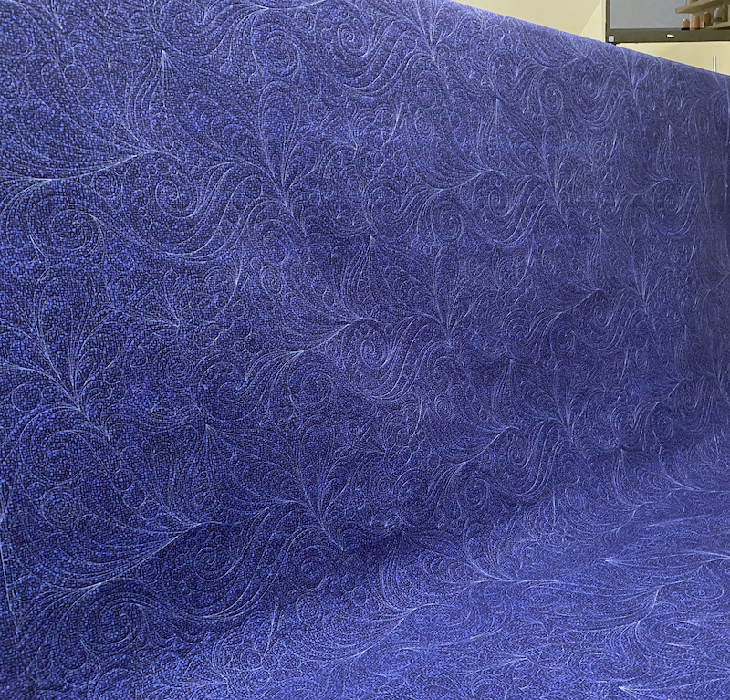 |
| Graffiti E2E #7, Backing Side of Pam's Quilt |
I love it when clients bring me solid backing fabrics!
Had to show you the front of Pam’s quilt again so you could see how truly subtle that quilting design is on the front of her quilt, when you view the whole thing from a distance. (Also notice how soft the quilt is where it pools onto the floor, despite all that heavy quilting -- that's thanks to the silky, supple drape of the Quilters Dream Bamboo/Silk/Cotton blend batting). Similar to Mildred’s Road Home quilt that I showed at the beginning of this post, your initial impression of the quilt is of the piecing and those gorgeous fabrics. The quilting design, although it’s complex and detailed, adds subtle texture and movement from a distance without overpowering the quilt at all.
The elaborate quilting designs I’ve shared today obviously aren’t going to be right for every quilt, nor will they appeal to every quilter. That’s why I have over 550 different digital pantos (and counting!) in my design library, in a variety of styles from simple to complex, traditional to modern, and everything in-between. Do you have a favorite digital quilting design, or a design you've been wanting to try but are worried that it might overpower your quilt? Tell me all about it in the comments! Meanwhile, I'm linking up with my favorite linky parties, listed on the left hand sidebar of my blog. Have a wonderful week, and happy quilting!
PSST!! I'd Love to Quilt for YOU!
By the way, if you or any of your quilty friends has a quilt top or two that needs quilting, I'd be delighted to quilt for you! I am currently scheduling quilts for completion in early September. Click here to learn how easy it is to book a quilt with me!


12 comments:
All your quilting is beautiful and thanks for explaining about thread weight versus thread color verses fabric color! It's all making more sense to me!
long arm is so different than hand quilting - what you show is way more quilting then I would put in a quilt but I know it is a totally different form of quilting isn't it. Hope you are still allowing enough time to make your quilts still!
I loved this post (and the quilts, of course)! You really highlighted the differences in how the quilting shows up, depending on thread weight and color and their contrast with the fabics. Beautiful work!
While I'm not a longarmer - I quilt mine with a Juki TL2010Q, your comments on the thread you used was very informative. Thanks for stopping by my blog via Design Wall Monday. Never thought about it resembling an I Spy. Blessings,
You are so talented with thread and design decisions. Getting it right makes all the difference. I loved seeing the difference the same pattern makes on two very different quilts!!
You are such the artisan when it comes to long arm quilting. This one really stands out and is beautiful! Hugs
All are gorgeous, Rebecca! I have a question for you about your QMatic when you get a chance to answer! Graffiti and the peacock motif are gorgeous!
I love it when you explain your quilting process. So fascinating! Thanks for sharing the lovely quilts on Wednesday Wait Loss.
Once again, I am blown away by your mastery of long arm quilting. I appreciate the behind explanations for thread, batting and quilting design choices.
The quilt is gorgeous and the quilting designs are just as lovely.
I love the same pantograph on very different quilts. It is fun to see how they really can change a quilt...and in one be less of the star of the quilt than the other! Thanks for linking up to Tips and Tutes!
Thanks for including the names of the pantographs you used. I definitely need to add those to my wishlist.
Post a Comment