Showing posts with label Pantone. Show all posts

Tuesday, December 12, 2023

Custom Deco Quilt Palette for 2024 + QAL Week 4, 108 Weeks Behind Schedule

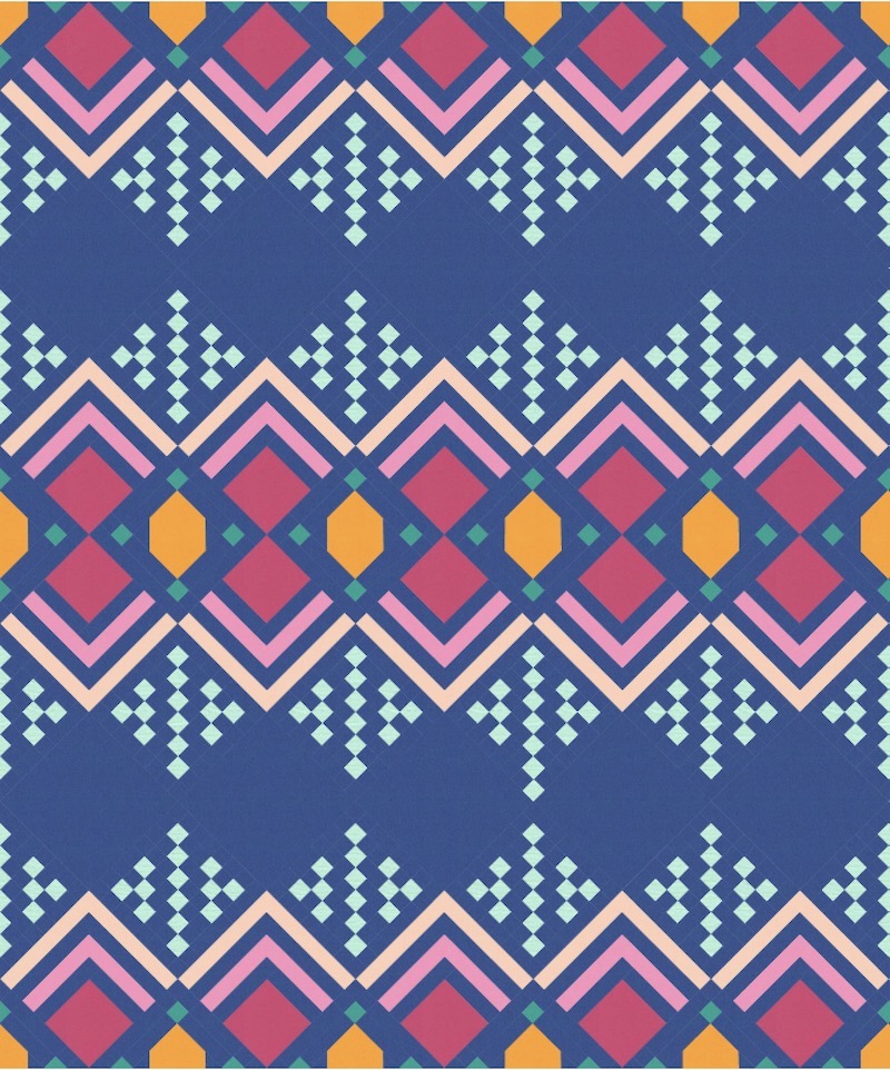
56 x 68 Deco Throw Quilt, PANTONE Pairings Palette for 2024

This is the time of year for sleigh bells, twinkling lights, caroling... and complaining on social media about how much we disagree with the design industry's color forecasters' predictions for Color of the Year.  PANTONE Europe's Color of the Year for 2024 is Peach Fuzz:


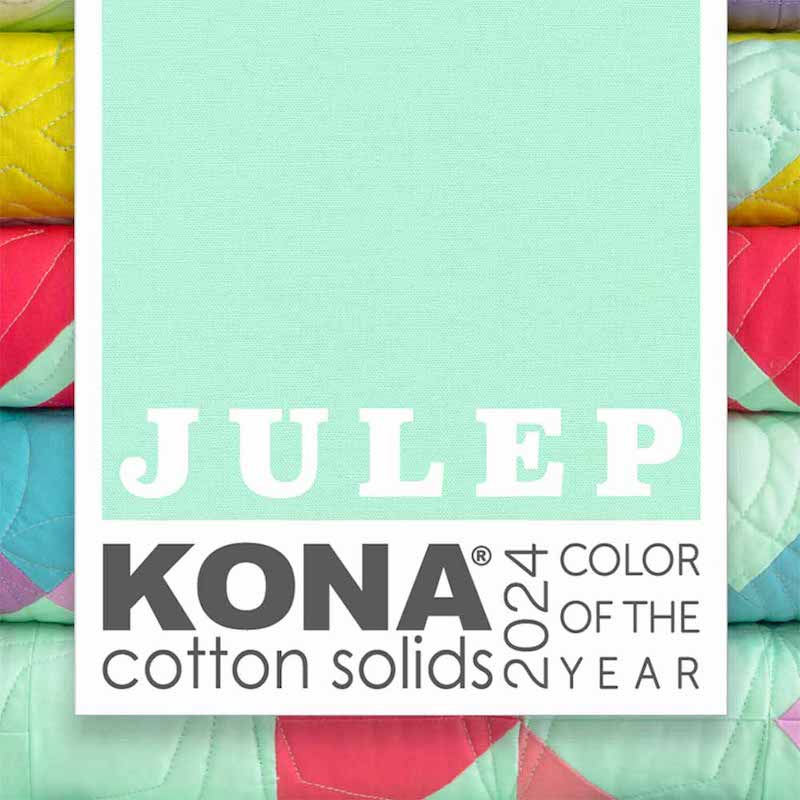
And Robert Kaufman's Kona Solid Color of the Year for 2024 is a pale aqua they're calling Julep: 


Looking at these two "new" color trend predictions side-by-side, many of us are getting flashbacks of  Margo and Todd's bedroom decor from the 1989 holiday movie National Lampoon's Christmas Vacation.  

Pantone Peach Fuzz Walls with Kona Julep Vase and Window Blinds

"Why is the floor all wet, Todd?"

"I don't know, Margo!!"  

"Why does Pantone think our 1989 bedroom set will be the embodiment of global lifestyle trends at the macro level in 2024?"

"I DON'T KNOW, MARGO!!!" ðŸ˜†

Wednesday, February 27, 2013

Got to Be Seen Green: Emerald Fabric Faves for 2013

I posted here recently about how much I love Pantone's Color of the Year for 2013, Emerald Green.  I really do want to challege myself to do something with emerald green in a quilt this year, so I browsed one of my favorite online quilt shops, equilter.com, and this is what I came up with.  From top to bottom, left to right: "Bursting With Color Jeweled Abstract," Emerald, by Hoffman; "Color Weave," Dark Green, P & B Textiles; "Deco Delight Waterfall Abstract," Shamrock Green, Fabric Freedom; "Marble Faux Hand Dye," Emerald Green, Quilter's Choice; "Pacifica Paua," Bottle Green, New Zealand Import; "Solid Sateen," Emerald, Kaufman; "Floral Legacy Lavish Petals," Dark Green, Kona Bay; "Geometrix Stylized Stars," Bamboo, Fabric Freedom; "Floral Legacy Lavish Petals," Hunter Green, Kona Bay; "Marbled Blender," Emerald Green, Choice Fabrics.

I didn't order any of these yet because I have SEVERAL projects lined up that I need to finish (some not even started yet) before I can start playing with emerald green.  So, if you decide to add some of my emerald green fabric picks to your own stash, please leave some for me!

Monday, February 18, 2013

Meet Pantone's Color of the Year for 2013: #17-5641 Emerald Green!

Emerald Green Peacock Feathers
I know I'm a bit late with this announcement, but normally, when the color authorities at Pantone announce their Color of the Year, I don't get too excited.  Color forecasting is useful for designers, but only up to a point.  After all, redecorating an entire home in the hottest color of the year is a sure-fire way to date the interiors -- literally -- such that people say, "Ugh; her whole house is painted that hunter green and burgundy that everyone loved back in 1987!"  I generally advise my interior design clients to choose colors that speak to them personally rather than chasing the latest trend, with a few exceptions.  Since manufacturers around the globe worship faithfully at the feet of these Pantone folks, rushing to churn out products and stock inventories with the colors Pantone predicts will be popular, it's somewhat of a self-fulfilling prophecy.  At any rate, I know that the Pantone Color of the Year and the Pantone seasonal color palettes will be widely available for home goods and accessories across a wide range of price points, in just about every retailer.  Obviously clients who are willing to pay premiums for custom orders can get any color they want in just about anything, but for those on a budget, it really helps to work with colors that are easy to find everywhere from the most expensive showrooms right down to more affordable places like Restoration Hardware or even Target.
Emerald Green Bath, from Architectural Digest France

But for 2013, Pantone's color of the year is Emerald Green #17-5641, and I'm in LOVE!  Brighter and more vibrant than Hunter Green, but more sophisticated and subdued than Chartreuse, Emerald Green feels both fresh and timeless.


Emerald green looks modern and edgy mixed with black, white, and contemporary furniture shapes.

If the bold, dramatic impact of an all-green space is too much for you, experiment with Emerald Green as an accent color:

Emerald Green Draperies and Lampshades, photo from Brittany Stiles

Emerald Green Planters with Tangerine Front Door, from The French Tangerine
(Interestingly, Pantone's Color of the Year for 2012 was named Tangerine, but it was really more of a reddish orange than a true Tangerine).

One reason that Emerald Green appeals to me as more than just a passing trend is that the color is found in nature and will always be associated with the gemstones by the same name.  Consider this 1928 Cartier Indian Emerald necklace, once owned by Marjorie Merriweather Post and now in the Smithsonian's collection.  This statement piece is just as breathtaking today as it was nearly a century ago.  Emeralds will never go out of style.

Post Emerald Necklace, Cartier c. 1928, Smithsonian Collection


Floor Tiles by Claesson Koivisto Rune

Have I gotten you excited about Emerald Green for 2013 yet?  I'm already looking around my own home for opportunities to introduce some deep, rich Emerald Green, and I think I'll challenge myself to incorporate some of this color into at least one of my quilts this year as well.

Thursday, October 13, 2011

Design for Today and Tomorrow: Insights from Michael Payne of HGTV's Designing for the Sexes

Rebecca with celebrity designer Michael Payne
Although I'm still sick with a nasty cold (Bernie insists I have SARS), I drugged up on cold medicine and filled my purse with cough drops and Kleenex so I could attend the WCAA Charlotte Chapter Expo last Friday with guest speaker Michael Payne
Michael Payne is best known for his nine years as the original host and interior designer for the HGTV hit series, Designing for the Sexes.  His design career has spanned three decades and he has authored a book called Let's Ask Michael: 100 Practical Solutions for Interior Design Challenges.  He currently has licensing agreements with a variety of companies to produce the Michael Payne Home Collection of furniture and accessories, is a popular speaker at design industry events throughout the country, and teaches a design seminar at UCLA.  On top of all that, he's a genuinely nice guy, insisting that we address him as Michael instead of Mr. Payne, patiently answering all of our questions throughout his presentation, and mugging for photos with us afterward.

The topic for Michael's morning seminar was Designing for the Changing Economy and Changing Lifestyles.  We all know the economy still leaves much to be desired, and those of us in the biz know that tighter budgets require even more skill and creativity from designers in order to meet our clients' needs functionally and aesthetically without breaking the bank.  Even in tough times, Michael reminded us that authenticity, quality and service are still more important to clients than price tags alone.  After all, no one needs interior design services the way they need food or health care.  What we're doing is about luxury, enhancing people's lives by enhancing their space so that it looks better, works better, and makes them feel better.  Everyone wants lower price tags when we're having budget discussions, but if the quality isn't there when the draperies and furnishings are installed we forget how much we saved and focus instead on how disappointed we are with the outcome.  It's the same with service -- as interior designer Mary McDonald remarked on a recent episode of the Bravo reality design show Million Dollar Decorators, interior design is really a service industry, and you need to be there when the client is upset or when things go wrong.


Green Design circa 1947: Goodnight Moon by Margaret Wise Brown, ill. Clement Hurd 
One of the major trends Michael discussed is the increasing importance of green design.  No, not like the Great Green Room with the Telephone and the Red Balloon (sorry; couldn't resist!).  Green Design isn't about a color or a certain look, it's a conscious decision to be aware of how the choices we make impact other people and our Earth, and a commitment to make the most responsible choices we can throughout the design process to respect the environment and the needs of the rest of humanity.  Although there has been a lot of buzz about environmentalism in the design world for some time, the frustrating thing for designers and our clients has been the relatively limited choices -- and very high price points -- of ecologically-friendly fabrics, floorings, and furnishings.  Furthermore, although consumers care more about the environment than ever before, many are confused about what green design really means.  Michael gave the example of his prospective clients who proudly showed him their newly-constructed home, supposedly all "green" design, including renewable bamboo flooring throughout.  However, where did that bamboo flooring come from?  Asia.  How did it get to California, to his clients' home?  Well, it went on a truck from the forest to the port, where it was loaded onto a ship, then it was brought all the way across the Pacific Ocean, unloaded onto another truck...  Oh!  The carbon footprint of this bamboo flooring turned out to be enormous, so that sustainably harvested hardwood flooring from the American Northwest would have actually been kinder to the Earth.  If you're interested in learning more about how to make greener choices in your home, ASID has a great overview of green design for consumers here. 

According to Michael, sustainable design is going to become the norm rather than the exception in years to come, and prices will come down naturally as demand increases.  It's our job as designers and consumers to keep asking the companies we do business with for greener options; executives are gathered in their conference rooms trying to figure out what we want to buy -- if we tell them (over and over again!) that we want socially responsible, environmentally friendly products, they will give them to us in order to meet consumer demand.  Some of the exciting new products already on the market are LED (light-emitting diodes) lights that come in a wide range of color temperatures to satisfy our longing for light that is energy efficient as well as attractive, and even OLED (organic light-emitting devices) products for surfaces based on the phenomenon of bioluminescent marine life.

Another interesting, somewhat related trend Michael discussed was downsizing. Michael pondered whether someday we would all question the idea that an individual has the "right" to build whatever they want on their land, regardless of the effect on other people, and whether it was okay for individuals to squander more than their share of utilities and natural resources just because they could afford to pay for it. It's certainly an interesting idea. He referenced a family of four living in a 10,000 square foot home, who spent most of their time huddled together in a small seating area off their kitchen that was only big enough for a sofa, one chair, the fireplace and television. These clients and others Michael works with have subsequently moved into much smaller homes by choice rather than necessity, asking for well-designed, multi-functional living spaces without all those extra rooms that no one ever used. This challenges designers and architects to create multifunctional spaces, because it takes a lot of careful planning to successfully move a family from a 10,000 SF home to a 500 SF home that meets all of their needs for storage, meal preparation, entertaining, etc. as well as aesthetics.

"America's Largest Home" at 175,000 SF: Biltmore Estate in Asheville, North Carolina

I'm not seeing voluntary downsizing with my own clients here in Charlotte yet, but it's certainly interesting to think about.  Michael cited a recent study done by the National Association of Homebuilders indicating that, for the first time in decades, the size of new homes in the United States is expected to shrink 10% by 2015.  The economy undoubtedly has something to do with this, but Michael feels that consumers are also asking for smaller homes after living in larger homes that didn't really fit the needs of their family.  A big problem with massive homes has always been that with so many rooms and windows, it costs a fortune to furnish and decorate it, and clients who have recently moved into much larger homes tend to be shocked when they find out how much more they will have to spend on furnishing and decorating to make that castle feel like a home.  That's something I've seen a lot of in my market, particularly with clients who relocated from smaller homes in the much more expensive real estate markets of the Northeast.  With lower housing prices and property taxes, New Yorkers moving to Charlotte often can double or triple the size of their homes without paying any more than they did up North.  However, when homes are smaller, clients can afford to invest in quality furnishings and beautiful finishes that will last a lifetime simply because they don't need to purchase so much of everything.

Other trends Michael sees on the horizon include increased use of motorization whenever budget allows, especially in window treatments, clients rediscovering wallcovering in a big way, and of course he talked about the hottest color trends for the near future.  Fashion trends trickle down to interior design, so the best place to find out what the hottest colors for home furnishings will be next year is to take a look at the runways today, or to check out Pantone's Fashion Color Reports, just a mouse-click away right here

That pink honeysuckle color is Pantone's Color of the Year for 2011.  Do you see what I don't see here?  No red anywhere -- and there's no red in the Pantone fashion forecast for Spring 2012, either.  Let's all have a moment of silence for red, shall we?  :-(

The reason we have to care what Pantone says about color is that manufacturers pounce on these forecasts and incorporate the predicted hot colors into all kinds of products for the home, from towels and bedding to surfaces and accessories.  In a way, it's a self-fulfilling prophecy, but it's also a great help for a DIY homeowner working with a tight budget.  I can promise you that you will have a lot better luck finding what you want at lower price points if you choose an on-trend color scheme that's going to show up everywhere from the high end stores to places like Pottery Barn and even Target.

So, all in all, this was a great seminar.  I got to connect with fellow designers and workrooms as well as vendors at the event.  Several of the products vendors were showing tied in directly with what Michael had to say, like the gorgeous Missoni fabrics from Old World Weavers through Stark and the overscaled paisley fabrics from F. Schumacher & CoSomfy was on hand to talk about motorization options, and I picked up a new drapery hardware line as well.  Sniffles be damned; it was a day well spent!