
Showing posts with label Schumacher. Show all posts

Thursday, November 9, 2023

Carrie's Modern Baby Quilt with Mister Marbles E2E + Quilting Inspo from the Interior Design World

My quilting clients bring me the best quilts!  Seriously!  I am so inspired by this 40" x 40" baby quilt that I quilted for my client Carrie recently:
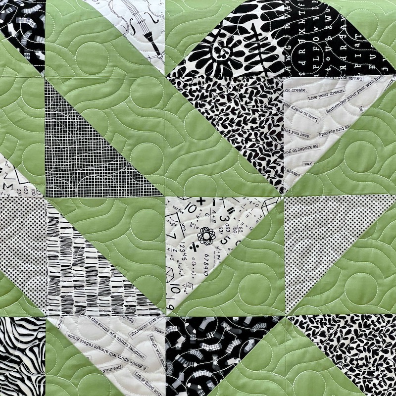

Mister Marbles E2E Quilting in King Tut 40 wt Cotton Thread, Color Temple


I love this quilt because it's so striking, modern, and abstract, making it a perfect choice for new  parents who prefer to avoid gender stereotypes in their nursery themes.  I also love that this baby quilt looks so sophisticated and artsy, yet the construction is simple and straightforward, ideal when the shower is next week and you're scrambling to come up with a gift.  All you need is an assortment of black and white print fabrics paired with a solid, sew a total of 64 HST (half square triangle) units that all have one solid color triangle sewn to one black and white print, and then you rearrange those units on your design wall until you have a fabulous layout like Carrie's...  And before you know it, you're done and it looks amazing.  I have quite a few black and white prints in my stash, so I'm tucking this idea away for the next time I need to make a baby quilt.

I quilted this for Carrie using my Mister Marbles design, using a heavier 40 weight King Tut cotton thread in color Temple (White) to ensure the quilting design would stand out so nicely against the solid green fabric -- I knew the quilting design would disappear in those busy black and white prints (this post contains affiliate links).  I like the energy and movement of those wiggly, ripply lines and circles in the quilting for this quilt.  The batting is Quilters Dream Bamboo, a blend of bamboo, silk, cotton, and Tencel that is my absolute favorite for baby quilts, so I stock it in the 60" wide bolts.  

Here's the whole quilt again in all of its fabulousness:

Carrie's 40 x 40 Baby Quilt with Mister Marbles E2E


Saturday, January 18, 2020

Where Do You Get Your Design Inspiration? Appliqué Inspiration From Interior Design Fabrics

I'm still plugging away at my Spirit Song quilt top, albeit intermittently.  So far I have four of the twelve 16" blocks completely assembled:


Four 16 Inch Blocks Assembled, Eight More to Go
It's tedious piecing at this point because I'm matching up triangles with seams that don't nest.  Lots of unpicking and finessing to get those triangle points to match up to my satisfaction!  But meanwhile, my mind is on other projects, inspired by everything I see around me.  If you're one of those sensible people who has made a resolution not to start any new projects or buy any new fabrics in 2020, you should probably stop reading this RIGHT NOW.  You have been warned...

So this gorgeous photo landed in my email in-box the other day in a newsletter from the interior design fabric supplier F. Schumacher


Linen Print Roca Redonda in Carbon and Multi from F. Schumacher, Retail $248/yd
I love how fresh and current this 18th century French botanical pattern looks in this colorway, updated with shades of coral, emerald and turquoise against that carbon gray background.  Wouldn't this be a fun color palette for an historic or traditional appliqué quilt pattern?  I especially love that dusky background color.


Moda's Ombre Confetti in Soft Black, available on Etsy here (affiliate link)
Moda's Ombre Confetti in Soft Black, available from an Etsy seller here, would give me a similar effect as a background fabric.  The black and gold metallic dots are clustered most densely near the selvages of the fabric and are much more sparse in the lighter parts of the fabric, so I'd likely use the middle areas of the fabric for my appliqué backgrounds and then use the areas along the selvages for borders or in pieced blocks.  

If you're not a fan of the metallic dots and you want to stay truer to the background in the inspiration print, you could try Sketch in Charcoal from Timeless Treasures, available on Etsy here:


Sketch in Charcoal from Timeless Treasures, available on Etsy here

Then, for the applique elements themselves, there are all sorts of delicious possibilities.  I could see this Jade Green Batik Blender from Timeless Treasures for some of the leaves:
Jade Green Batik Blender from Timeless Treasures, available on Etsy here
Kaffe Fassett Collectives prints from Free Spirit Fabrics would also work well for the appliqué elements.  
Philip Jeffries for Kaffe Fassett Collectives Bundle, available on Etsy here

I love fussy-cutting for applique from the oversized prints from Kaffe Fassett.  An emerald and turquoise flower or feather can make for a striking appliquéd leaf.  So much fun!  Back to the inspiration fabric from F. Schumacher:

Appliqué Inspiration Fabric, Roca Redonda in Carbon and Multi from F. Schumacher
Although I like Kaffe Fassett Collectives for some of the green and turquoise elements, the other colors in this palette are a bit more subdued.  To recreate the corals, aquas, and ochre shades found in my inspiration fabric, I'd probably turn to prints from Anna Maria Horner's Conservatory collection for Free Spirit Fabrics:
Anna Maria Horner's Conservatory collection for Free Spirit, available on Etsy here
Of course, I wouldn't be using ALL prints for my appliqué   I'd want plenty of solids and tonal solids as well.  I feel like I'd need to mix in a handful of luscious shot cottons for this project:


Peppered Cottons from Pepper Cory, available on Etsy here
In the photo above of Pepper Cory's Peppered Cotton swatches, you can see that different color yarns are used for the warp and weft of shot cottons, which gives them their fabulous color-shifting properties.  They're much more interesting than plain solid fabrics, yet the colors aren't hyper-bright to the point of distraction.  The effect is subtle, especially in an appliqué composition where the shot cottons are combined with batiks, prints, and true solids.

Last but certainly not least, I adore the tiny detailed elements of the F. Schumacher inspiration print fabric, many of which would be too small to execute as applique.  Those delicate vines, tiny leaves, and other details would be exquisite if they were embroidered using Sue Spargo's beautiful threads from Wonderfil:


Sue Spargo's Eleganza Threads from Wonderfil, available on Etsy here
And, while we're at it, some of those flower centers would probably benefit from a smattering of seed beads here and there, so long as our quilt isn't going to be used on a bed and frequently laundered.  My pick, to keep the palette true to my inspiration fabric while adding just a subtle bling, would be these size 11/0 Czech glass seed beads from Etsy seller lanabeads2:


11/0 Czech Glass Seed Beads in Taupe, available on Etsy here
Have I inspired you to start a new project yet?  Here are a few patterns that would be beautiful in this color palette: 


Love Entwined, Historic Reproduction by Esther Aliu, pattern available here
Like the F. Schumacher inspiration fabric, Esther Aliu's masterpiece historic reproduction pattern "Love Entwined" was based on an 18th century antique quilt, so I'd expect it would look amazing rendered in the updated Carbon & Multi colorway of the linen drapery fabric.

However, this color palette would also be delightful for one of Sarah Fiehke's whimsical applique patterns such as her 2017 Down the Rabbit Hole BOM, for which patterns and instructions are available here:
Down the Rabbit Hole by Sarah Fielke, pattern available here
Ooh, and imagine using this color palette for Karen Kay Buckley's Majestic Mosaic appliqué quilt, pattern available on Amazon here:


Majestic Mosaic by Karen Kay Buckley, pattern available here
One last peek at our inspiration photo:


There are a lot of books and workshops out there on color theory, but you really can't go wrong if you choose your color palette based on a mix of colors that speaks to you immediately as soon as you see it.  Interior design photos, fine art paintings, travel photos -- all are terrific sources for selecting colors for your next quilt.  

Where do YOU find your best design inspiration?  Let me know in the comments.

Meanwhile, there are a bazillion coral-colored Birds in the Air blocks waiting for me to sew them together for my Spirit Song quilt...


Still In Progress, my Spirit Song Dress Code Quilt

Happy weekend and happy stitching, everyone!  I'm linking up today's post with:

·       Slow Sunday Stitching at Kathy's Quilts  
·       Oh Scrap! at Quilting Is More Fun Than Housework
·       Design Wall Monday at Small Quilts and Doll Quilts  
·       Monday Making at Love Laugh Quilt
·       Moving it Forward at Em's Scrap Bag

·       Colour and Inspiration Tuesday at Clever Chameleon

Saturday, September 7, 2019

F. Schumacher Gone Quilting? Quilting Inspires Interior Design Inspires Quilting...

Those of you who have been with me for awhile know that I am more of a designer than a maker.  For every 10-15 quilt ideas that I sketch out on my iPad or in EQ8, only one or two of them ever makes its way into the tangible reality of fabric and thread.  I spent 20 years in the interior design industry, where I used to pass my window treatment, bedding and pillow design sketches off (along with bolts of gorgeous fabrics and trims and detailed work orders) to the amazingly talented hands of my custom drapery workroom.  Then the makers in the workroom would turn my designs into reality while I got started dreaming up new ideas for another client.  

So anyway, because of my interior design background, this glossy, oversize design magazine from F. Schumacher called The Bulletin appears regularly in my mailbox.  And I had to share with you guys that, according to the tastemakers at F. Schumacher at least, "American Folk Art" is #2 on the list of up-and-coming interior design trends:


This is a Hot NEW Trend, According to F. Schumacher
Now, how cool is that?  We quilters have all just been so ahead of our times...  Those two fabrics pictured above are jacquard woven matelasses.  Although the one on the right is named Tristan Patchwork, it's not actually patchwork -- or quilted -- at all.


76762 Tristan Patchwork from F. Schumacher, Retail $236/yd
Naturally, as a designer AND a quilter, I love this fabric.  It would be fabulous for light duty upholstery, throw pillows, or a structured window treatment.  It comes in Yellow, Charcoal, or Indigo and the scale of the "blocks" is a good deal smaller than they would be on an actual quilt -- the pattern repeat is 13.5".  So that's interesting -- modern quilters are playing with scale by making quilt blocks that are larger in size, while textile manufacturers are playing with smaller-scale versions of the same traditional block patterns.  I also love how the traditional 2-color quilt idea is kicked up a notch by adding a second, paler yellow to the mix that almost reads as a visual echo or a shadow.  


My Pea Soup Paint Strip Challenge
Hmmm...  Our guild is doing a "paint strip challenge" for next spring's quilt show, and I had the misfortune to draw a very BORING strip of sage greens that doesn't feel challenging AT ALL.  I'm supposed to use at least two of the greens from my paint strip in my challenge quilt but I am sick of those greens already because they are in my Frankenwhiggish applique project, my Pineapple Nostalgia, even in Lars's Mission Impossible quilt.  I guess I misunderstood the challenge -- I thought they were going to have two or more "difficult" colors in each envelope, or colors that you don't typically think of as "going together" or something.  When I saw that Tristan Patchwork fabric in the Schumacher magazine this morning, I realized that I could definitely do something similar using my two shades of green where they are using yellows, but I'm not sure that's going to be interesting enough to hold my attention all the way through to a quilted and bound finish, you know what I mean?  I'd rather do a color challenge based on THIS story in the same magazine:


I Want THIS to Be My Color Challenge!
How much fun would it be to come up with a quilt based on THOSE two pages?  This is fashion designer Johnson Hartig of Libertine, and I absolutely adore his new interior fabrics collaboration with F. Schumacher.  I love how Hartig has taken this uber-luxurious, high-end cotton viscose velvet fabric and decorated it with goofy, campy Tibetan tigers.  It just makes me smile.  


77231 Jokhang Tiger Velvet from F. Schumacher, Retail $700/yd
Even MORE fun?  Check out this 3" wide trim, also from Johnson Hartig's collection for F. Schumacher, adorned with SAFETY PINS.  This is so delightful to me that it ALMOST tempts me to return to interior design, just so I can talk someone into decorating their living room draperies with a wide band of safety pins down the lead edges: 
77270 Punk Rock Mix Tape from F. Schumacher, Retail $198/yd

(Attention, DIY Fashionistas -- anyone with a sewing machine can recreate this look by sewing a bunch of safety pins to ordinary 3" wide grosgrain ribbon from JoAnn's...)

So my own PERSONAL interpretation of our guild's color challenge is going to be: How can I incorporate my boring greens into the weirdest and most unexpected quilt possible???  

But that challenge piece is WAY down on my list of priorities at the moment.  At the moment, I'm focused on:

  1. Getting back to my longarm machine to try out a different thread combination and hopefully get one of my two outreach tops quilted
  2. Working on a commission to finish a Double Wedding Ring UFO
  3. Anders' sampler quilt, Beware the Ishmaelites

Have a wonderful weekend, everyone!

I'm linking today's post with:

MONDAY

·      Design Wall Monday at Small Quilts and Doll Quilts 
·      Monday Making at Love Laugh Quilt

TUESDAY

·      Colour and Inspiration Tuesday at Clever Chameleon

·       To-Do Tuesday at Home Sewn By Us

Wednesday, August 13, 2014

Bring On the Bling! 750 QE Sewing Machine Cover, Part Deux

Almost Finished: Sewing Machine Cover for my Bernina 750 QE
So, this is what my in-progress sewing machine cover looks like today.  I think it looks like a mailbox.  Anyway, if you missed my Part One post about this project, you can catch up with that here.  Moving right along...

After spending a good chunk of eternity free-motion quilting my Kaffe Fassett Millefiore fabric, I used the muslin mockup pieces as a pattern to cut the sewing machine cover pieces out of my quilted yardage, like so:

If I hadn't needed to precisely position a cutout at the back of the cover for my thread stand, I probably could have skipped that whole muslin mockup.  It took WAY too long to custom-quilt my project fabric for me to risk messing it up with a cutting error, so it was worth the extra effort in this situation. See how much quilting I did to get the stiffness I wanted?

Quilted Yardage, Back Side View

I had some leftover covered cording lying around that I had made for my master bedroom throw pillows last month, and I decided to use it up on my sewing machine cover:

The cord fabric is F. Schumacher's pattern 62613 Betwixt in Peacock/Seaglass, a VERY loosely woven, 100% cotton fabric that is flexible and soft, but bulky and thick.  The piping is 5/32" diameter, the largest size that I can make on the serger, which allowed me to contain the fraying fabric edges and maintain a perfectly even seam allowance.  Making the cording on the serger like this has the added benefit of compressing and flattening the seam allowance, which makes the cording as easy to use in the project as a readymade lip cord trim.  The fabric strips were cut on the bias to follow the weave pattern.

As you can see in the photos, I offset the piping from the edge of the red fabric pieces by about 1/8" -- that's because the widest setting on my serger was still not quite 1/2" and my sewing machine cover would have finished too big if I had just attached the piping with raw edges and serged edges aligned.  I used my 4D zipper foot with dual feed engaged to attach the piping on my 750 QE sewing machine. 

To finish off the raw edges of my sewing machine cover along the bottom edge and around the thread stand cutout, I wanted to bind it in the same Schumacher fabric, but it was way too bulky to double up and wrap it around the way you would do with a lightweight cotton quilt binding.  What I ended up doing is this: I measured and cut bias fabric strips that were wide enough to be doubled on the front side of the machine cover, but only a single thickness wraps around to the inside.  I overcast one raw edge of the fabric strip on the serger first, then serged the other raw edge of the contrast fabric strip directly to the right side of my sewing machine cover (lots of fun driving around the inside of the cutout shape on the serger, let me tell you, but I managed!):

Binding Fabric Serged to Right Side of Machine Cover Along Bottom, Top Edge is Free
Now I had both raveling raw edges controlled and the binding strip was attached to the right side of the machine cover with an approximately 1/4" serged seam.  I then wrapped the loose binding edge to the inside and pinned it in place, making sure I covered the serged stitching with the binding fabric:
Pinning the Binding Prior to Stitching

Then I used Edgestitch Foot #10 to stitch in the ditch next to the binding from the right side of the project, and that secured the loose binding neatly to the inside of the cover.

After finishing the binding, I popped the cover over my sewing machine, and it was not exciting enough.  It needed something...  a monogram!  I briefly considered embroidering "Bernina 750 QE" on the machine, but then I decided that it's MY machine, MY dust cover, and it should be MY initials.

I chose the Gothic 4 monogram style from Embroidery Arts, my hands-down, all-time favorite source for machine embroidered monogram designs.  This monogram collection includes one fat and one skinny version of each letter, designed to be stacked rather than side by side.  My first and last initials are both R, and I thought that stacking two different R designs would be more interesting than positioning two identical Rs side by side.  I combined and enlarged the two monogram designs in my Bernina v6 Designer Plus embroidery digitizing software until it just filled the maximum stitching area of my medium embroidery hoop, experimented with thread colors a bit, and came up with this:

Pretty cool, right?  Then I stitched out a sample of the altered embroidery design onto a leftover unquilted scrap of Millefiore fabric, layered with batting and muslin backing to approximate my project fabric as closely as possible.  I got this:
Sample Stitch Out of Altered Design on Project Fabric

See why they tell you to always do that sample stitch out, especially when you're using a design from a new supplier or after you've done extensive editing to the design?  The first thing I decided from my sample stitch out was that the fat R needed to be a darker thread color to stand out better against the busy background fabric.  But then I noticed additional issues upon closer inspection:


My satin stitches aren't close enough together to give good coverage.  Also, when I stretched, distorted, and resized the monogram letters in my embroidery software, evidently the software did not recognize that the outline stitching was in fact outline stitching -- since I stretched the letters to be taller, all of the vertical outline stitches just got longer instead of the software adding more stitches to maintain a consistent stitch length.  If you look at the stitches that go horizontally and around the small curves, those stitches are all much shorter.  So I went back into my design software and ungrouped the design so that I had four separate elements: the fat R, the outline of the fat R, the skinny R, and the outline of the skinny R.  Then I selected each satin stitched letter, went into Object Properties, and changed satin stitch spacing from Manual to Automatic.  That increased the number of total stitches in the combined monogram from about 10,000 to about 12,000.  Then I selected each outline and clicked on "Outline Stitch" at the bottom of my screen, which automatically redigitized those stitches so that they would be nice and even.  I COULD have done another sample stitch out at that point to make sure I was happy with the results, but I am impatient so I hooped up my sewing machine cover instead.  I like to live dangerously:

Still loving all of the extra throat space on this machine, by the way.  Even though I'm using the medium embroidery hoop, the stiffly quilted sewing machine cover is bulky and takes up a lot of space.  On a smaller sewing machine, all of that bulk might have interfered with the operation of the embroidery module.  I drew chalk lines to help me position the monogram so that it was perfectly straight and centered on one of the red circle blobs of my fabric print.  Ta da:


Now, if I HAD stitched this as a second test drive sample, I would have seen that I like having those outline stitches evenly spaced, but that the stitching showed up better when they were longer -- and I would have gone back into my digitizing software to change that before proceeding.  But I didn't, so this is what I've got.  I'm happy with the thread colors I chose for both letters, but I'm a little sad that I don't see the contrasting outline thread as much as I wanted to.  Also, the positioning of the monogram is kind of high on the sewing machine cover, the lettering is still disappearing into the busy quilted background more than I wanted it to, and I'm not in love with it yet. 

Monogram Embroidered, Still Not in Love
So I asked my husband, "Bernie, do you think this needs some beads?"

And he answered, "No-it-does-not-need-beads" the way he would rattle off a phone number or the make and model of some hot rod we passed on the interstate.  And this is how I knew that it DEFINITELY needed beads.

This is not the first time I have added hand stitched beads to machine embroidery.  I've done it with decorative machine stitches, too -- it gives the machine stitching more of an individualized, hand crafted look.  It's much easier to execute than hand embroidery, too, because you can use the perfectly-spaced machine stitching as a guide for perfectly spacing your beads.  In this case, I decided to place one seed bead every two outline stitches around each of the monogram letters.  It didn't take as long as it would have taken to embroider the monogram by hand (assuming I had the skill and ability to do that, which I don't).  But, as with most of my bright ideas, it took much, MUCH LONGER THAN I EXPECTED IT TO!  :-)

Machine Embroidery Plus Beads
After I had blinged up the monogram with seed beads, I had to outline the red circle with alternating iridescent peacock colored bugle beads and cobalt blue seed beads.  As you can see, that beaded circle is a bit wobbly in places, because I followed the fabric print and the circle was designed a little wobbly.  I think it's okay.  And then, finally, I put the cover on my sewing machine and felt like it looked done.

Enough Beads?
I had a fleeting temptation to decorate the rest of the cover with an assortment of beads and/or sequins to embellish and play up the fabric print, but then I remembered that this was supposed to be a QUICK AND EASY project and I do want to get back to the quilts I'm working on.  I can always add more beads later if I decide it needs more.

This cover may or may not be finished at this point for one more reason.  The cutout for the thread stand could probably use a button or two:
Does It Need Buttons?  Hooks and Eyes?

It wants to sag down at the opening, which makes for a less-than-tidy fit.  However, if I put buttons or ribbon ties or whatever, that will just be annoying when I take the cover on and off.  If I do decide to add buttons, I'd love to make some turquoise Chinese ball knot buttons or maybe add a funky frog closure...

[At this point, Rebecca opens up another browser window and pokes around on Etsy...]

-- Eureka!  Check out this vintage 1950s frog closure that I just found on Etsy from seller Duchess General!  Doesn't that just look like it was MADE for my sewing machine cover?  It's the exact blues and greens that I used for my monogram, and I scored it for only $7.49 including shipping.  Perfection!
Vintage Frog Closure, Coming Soon to My Mailbox

So when that comes in the mail, I'll figure out how to attach it and THEN my sewing machine cover will FINALLY be done!

I'm linking up with Lee's WIP Wednesday at Freshly Pieced, Let's Bee Social at Sew Fresh Quilts, and with Esther's WOW WIP Wednesday linky party.  I'm also linking up with Finish It Up Friday at Crazy Mom Quilts, Whoop Whoop Friday at Confessions of a Fabric Addict, and Thank Goodness It's Finished Friday which is hosted by Quilting Mod this week.  I'm looking forward to seeing what everyone else has been working on this week! 

Monday, June 16, 2014

Let's Paper Piece Some Giant Pineapples!


18" Paper Pieced Pineapple Blocks!  Pattern FREE from Fons & Porter, available here
 Okay, so this is not technically on my design wall yet, but it's definitely on my mind.  I want to make a California king sized pineapple quilt.  I'm envisioning this in bright, cheerful colors, with lots of soft blues and greens to coordinate with the drapery panels that I've been promising procrastinating to make for my master bedroom.  (More on that later).  I spent some time perusing my quilting books, magazine clippings, and on Pinterest (you can see the antique pineapple quilts that are inspiring me here on my Pinterest Pineapple Quilt board) and decided that my favorite pineapple quilts were the antique ones with lots of very skinny fabric strips sewn into very large blocks.  I also determined that it will drive me nuts if my seams don't match up very well when the blocks come together, so I'll be paper piecing this. 

Gorgeous Pineapple Quilt from Flickr via Pinterest, Maker Not Identified


Modern Pineapple? Think Again -- Mennonite, circa 1880-1900, Maker Unknown
Now that I've gotten everyone excited about pineapple log cabin quilts, you'll be happy to know that I found a free foundation piecing pattern download from Fons & Porter here, which prints out in six sections that you connect to create one very BIG foundation piecing pattern.  All thoughts of doing this project on one of my vintage Singer Featherweight cuties evaporated as soon as I had taped the pattern pieces together, because this giant block seems to have been created with Big 'Nina 750 in mind.  Look how nicely that block fits under my behemoth of a Bernina!

18" Paper Piecing Pattern Fits Great Under the B 750 QE
Fontenay Vase in Porcelain, F. Schumacher
I am only at liberty to start yet another new quilt because I managed to disentangle myself from having to make the drapery panels that I promised to sew for my master bedroom.  I ordered the fabric six months ago, and then I stuck the bolt of fabric in a corner behind a door and thought of a million other things to do instead of making drapery panels.  In all fairness, it HAS been a very busy spring what with everything going on with the kids, the fundraiser quilt for Anders' fifth grade class, et cetera, but really, I just did not feel like wrestling with yards and yards of drapery fabric (grunt sewing) when I could be blissfully playing with bits and pieces of quilting fabric instead (happy sewing). So I finally dropped that lovely Schumacher linen print fabric (shown at left) off at my drapery workroom last week at my darling husband's insistence.  He said, "Do you even REMEMBER the last time you made drapery panels, or have you blocked it out -- like childbirth?"  ;-) 

Bernie reminded me that my current studio is not set up for working with long, multiple width drapery panels, and he said he'd rather pay my drapery workroom to make them than be forced to live with me while I'M making them.  I had nothing to say to that because I know it's true.  I loathe making drapery panels! 
So I'll make a couple of throw pillows out of this lovely F. Schumacher Betwixt woven geometric fabric instead, and then I'll starting a new quilt (or three).
Betwixt in Peacock/Seaglass, F. Schumacher

Meanwhile, back on my ACTUAL design wall, the nine bear paw blocks are done and they are staring at me reproachfully:

Bear Paw Blocks Finished, but Now What?
I love the blocks, and I know they are going on point like this, but I am kicking around a few different sashing and border options in the back of my head before I commit to a setting.  I just can't bring myself to sew them together just with plain white alternate blocks like I had originally intended.  Stay tuned...

I'm going to go ahead and link up with Design Wall Monday at Patchwork Times, because it's still Monday (barely!).  I can't wait to see what everyone else is up to this week!